Nicholas Felton is an icon in the world of data visualization and an information-design expert. He has spoken at countless conferences, he co-designed Facebook’s Timeline, and in 2011 Fast Company named him of the 50 most influential designers in the United States.
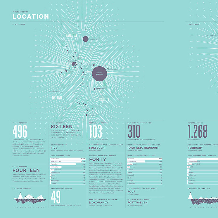
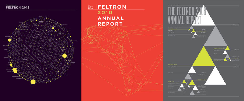
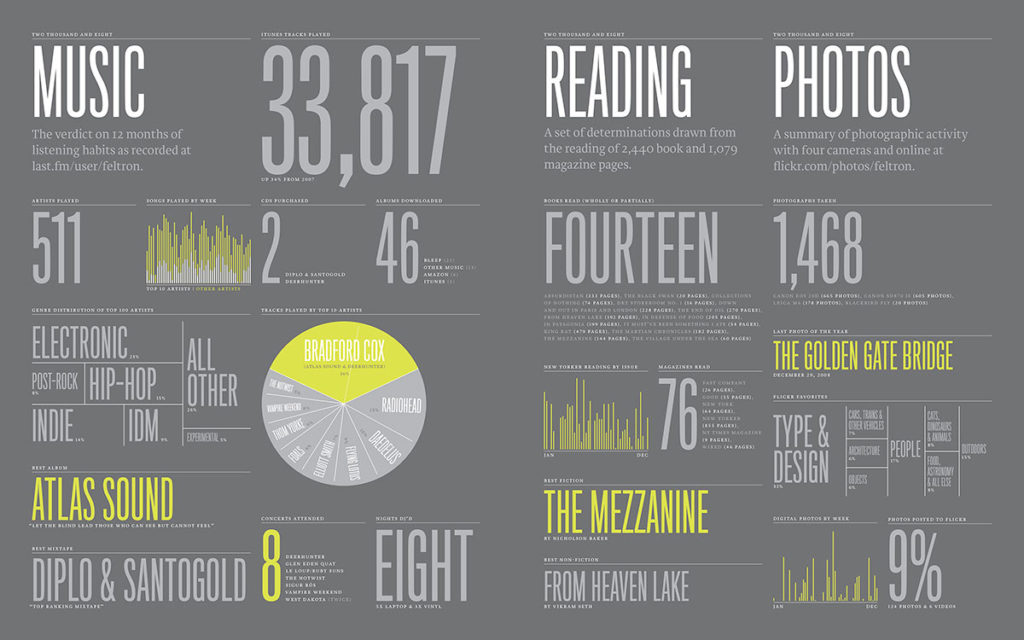
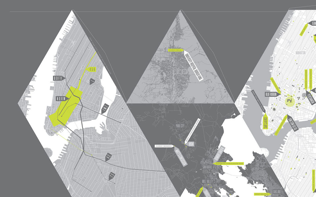
It was Felton’s obsession with data that led him to the series that helped establish him as a design celebrity. In 2005, he published a very detailed Annual Report, which chronicled the minutiae of his life—the states he’d visited, the music he’d listened to, his weekly work:play ratio, and much more—in a series of elegant charts and graphs. It was a fascinating study of personal data tracking and a gorgeous piece of design, all based on information drawn from his memory, calendar, photos, and Last.fm data.
“It started out as a fun project, a way to let people know what I’d been up to all year,” he says—but it turned out to be a lot more than that. This 2005 report was released at the dawn of the modern Quantified Self movement, and the enthusiasm it was greeted with completely changed the trajectory of his career.
THE MAP OF A YEAR
Felton was drawn to data at an early age. One of his favorite books as a child, Comparisons, contained hundreds of charts and graphs comparing various scientific phenomena. It was information design at its finest, and it stuck with him. He considered a career in science but was also keen on clean, modern design and print production, so he started his career as a designer in New York’s magazine industry.
Then, in 2005, he combined his love of science and love of design in his annual report. Its success led him to apply rigorous scientific methods to tracking his yearly data in the following years: miles traveled, beer consumed, and so on—everything from travel to mood to conversations with friends and colleagues. As his data sets grew, the designs became more challenging. “I usually have a vision of how I want the layout to look,” he says. “But problems arise when you’re trying to design for the data before you have it all together in one place. The data will never cooperate with your vision.”
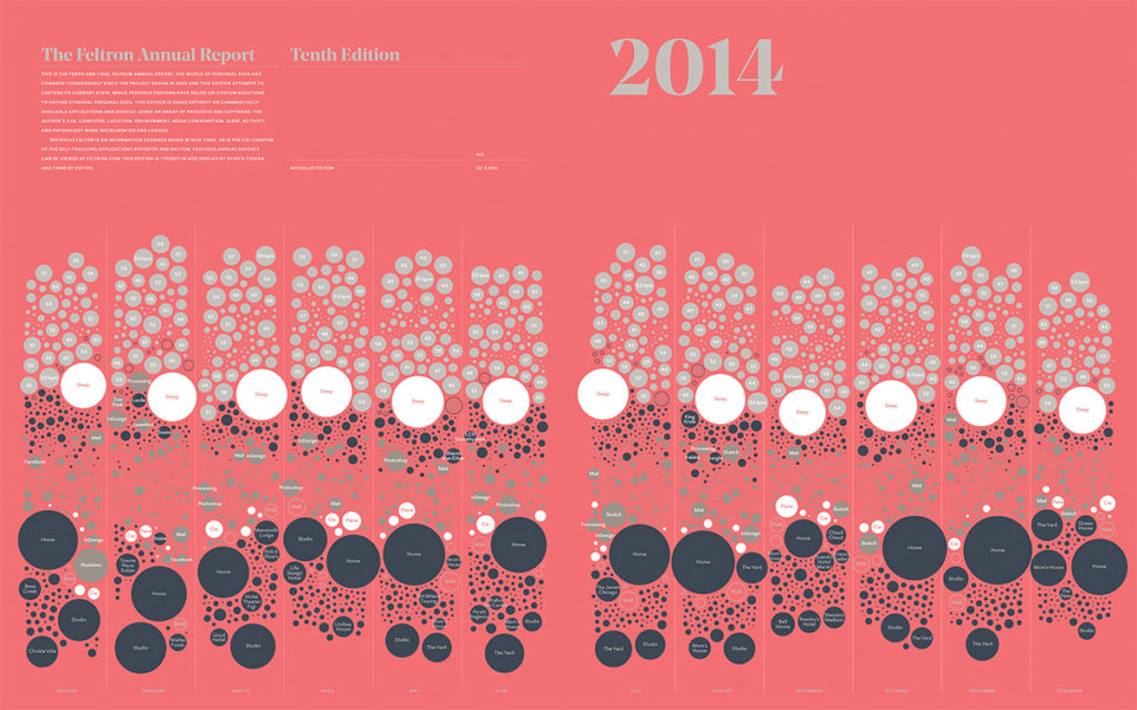
This endeavor required a new way of thinking about design. It’s a fickle material, data, and it’s not easily manipulated—not if you’re at all concerned about presenting it truthfully. Felton focused on clean, clear presentation of the numbers without any preconceived notions of how they were supposed to look on paper. “I always strive to make sure anyone can understand the data at a glance without too much work,” he says. “To do that, you have to understand the data and design around that rather than conforming the data to your design.”
Sounds simple, but anyone who’s tried to make a beautiful chart or graph knows how difficult it is to let data guide design. Felton has fully embraced the philosophy. He works with data-crunching powerhouse Processing to generate graphs and charts, and he has developed an arsenal of graphing tools that allow him to quickly see the shape of the data he’s working with. He then exports those graphs and charts to Adobe InDesign for layout. As an homage to his love of print, he allows anyone to download and print these reports. “I see print as one of our most mature technologies,” he says. “It’s been around for thousands of years, and the precision and quality we have today is simply incredible. I love print as a medium.”
PROMOTING SELF-AWARENESS
In 2009, Felton built the iPhone app and website Daytum with friend and colleague Ryan Case. They designed the app to track everyday data and automatically generate reports. It was downloaded by the thousands, and Felton considers it a good first step toward creating a general-purpose personal data tracker, but it wasn’t without issues. Users created their own fields, which led to a lack of consistency throughout the app. “They could name their fields anything they wanted, which caused some problems with the design,” he says. “We couldn’t anticipate every single thing they’d want to track. It also made comparing data with friends problematic. We learned a lot from making Daytum, and we incorporated those lessons into our later projects.”
Two years after making Daytum, Felton and Case were hired to design Facebook’s Timeline. The project proved to be a challenge for similar reasons. User data is almost impossible to anticipate, so the duo had to create a design that would be flexible enough to handle a wide variety of photos, videos, posts, life events, and more. The Timeline was a controversial addition to the Facebook experience, but Felton is pleased with the results. “In the end, we can’t control user content, but that’s good. Timeline is all about users’ lives and what they choose to include. From our perspective, that’s what matters most,” he says.
Felton’s newest project is a tracking app called Reporter. It uses randomly timed short surveys to gather data about users and, in the developers’ words, “illuminate aspects of your life that might be otherwise unmeasurable.” Surveys are very lightweight—questions like “Are you working?” with simple yes/no answer choices. Reporter handles the data gathering, which can be onerous for the average person. Surveys and question frequency are customizable, so users can keep track of the things that are most important to them.
NEW DEVELOPMENTS IN DATA
Reporter is an interesting twist on Quantified Self principles, and one that fits with Felton’s current state of self-measurement. He’s pressed pause on the Personal Reports. In years past, he meticulously monitored his life, but today he’s more hands-off. “I have a Fitbit like everyone else, but I’m not really doing anything with the data, and I’m not tracking anything directly,” he says. “It’s a strange feeling, and it’s also a relief.”
Instead of measuring data, Felton is focusing on new ways of presenting it. His soon-to-be-released book Photoviz explores the ways that photography can convey data. Long exposure, infrared, 3D perspectives, multi-image composites, and more are being used to tell stories and represent complex data. “It’s more than just images that represent the idea; it’s images that have actual significance to the data,” says Felton. Images can have a greater impact than charts and graphs while conveying the same (or more) information. (Watch Felton’s Photoviz presentation at WebStock 2015.)
For Felton, data is crucial for today’s designers. “Data is being collected and logged all around us every second of every day,” he says. “And most of it its just sitting there, waiting to for us to pick it up and use it. It’s one of the greatest opportunities designers have ever had to tell stories visually. It’s the most exciting time to be a designer or visual artist, and it’s data-driven.”
All of Felton’s annual reports can be downloaded for free from his website. The site also includes a list of future speaking engagements, events, and more. His book Photoviz will be available in April of 2016.
